Wednesday, April 1, 2020

Wash your hand -- then draw it!

I don't participate in social media during the day. By which I mean that my phone does not have any social apps and no notifications when I get an email. I only read blogs from my tablet when I am home. I opened a Instagram account that I used to post my sketches during October (Inktober) from my computer only. Now, moving one step closer, I installed the Instagram App on my tablet. I find that it is easier to post my sketches when I take a picture with my tablet and send it to Instagram. At this time, my focus on this blog and on Instagram is the process of learning to sketch, so that is what I am posting is my sketches.

On Instagram, I picked up a suggestion to draw my hand each day. [for posterity, I should state what right now is obvious: we are in the midst of the novel Coronavirus pandemic with the accompanying cautions and restrictions. That is the reason for the hashtag "wash your hand..." as a precaution to prevent infection] In my case, I draw it with some object that I use or have near me each day. I am posting several of the hand sketches here that have been on Instagram. I am currently using three sketchbooks with different paper, so I'm grouping the sketches based on paper. 

First is a notebook from Daiso, a Japanese dollar store in which most items sell for $1.50.
Daiso notebook back. $1.50 with smooth
paper that doesn't bleed with most inks.
This notebook has 50 pages, softcover, very smooth paper that is great for fountain pens and pencils. It does buckle when water washed and shows ghosting if written with ink on both sides of the paper. But the paper is quite lovely for such an inexpensive book. I bought it to practice doodles and people sketches. 


#washyourhandthendrawit series number 1
drawn with M+R pencil sharpener


My first #washyourhandthendrawit post was on the Daiso paper. This is labeled Hand#39 because I started a 100 hand challenge that was interrupted. So I am continuing the numbering series.
Number 7 in #washyourhandthendrawit series
CdA NeocolorII on Daiso paper
Also on Daiso paper, hand 47 using a Prismacolor vintage dry colored pencil on the crayon held in my hand. The hand was drawn with the crayon, a Caran D'Ache NeocolorII watersoluble pastel crayon. Love these lush color tools! 


Number 12 in the #washyourhand... series.
Fountain pen ink on Daiso paper


Last night's sketch (hand#52) was on Daiso paper because I decided to use fountain pens and ink. I am feeling more relaxed with drawing my hand, not the easiest thing! So with these three sketches, I can show some of the progression I am making in sketching hands. I highly recommend practice in drawing daily, and especially making yourself draw the same thing from many different angles. Trust me, as awkward as it may feel at first, you will be happier in time with your results!

Tuesday, March 10, 2020

Rocks and Trees

Joshua Tree National Park always makes me think of Dr. Seuss. When I was young, I thought the alien looking trees in some of his books were imaginary. Until I moved out to California and saw Joshua Trees.
03/09/2020 A big Joshua tree in the middle of a Joshua tree forest.
I planned to camp there this week, then this atmospheric river showed up. A desert full of rocks and washes is no place to tent camp in heavy rain! My friend, Jeannine, and I decided even two days would be better than rescheduling and having something else interfere.

Sunday, March 08, 2020. Sun and rocks behind a dead Juniper tree.

The weather Sunday and Monday was just about perfect: sunny, calm, with temperatures in the 60s during the day and 40s at night. The clouds were thickening all day Monday and by 4 pm it looked like a was storm moving in. I got back to Poway about 8 pm Monday night and by 9 pm it was raining. Great timing!


April 2015
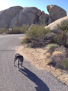
Chynna (my Aussie dog) in Joshua Tree National Park.
Joshua Tree NP is a land of rocks and "trees". Joshua trees are actually arboreal (tree-like) yucca plants. I first went there in 1997 with my sister. Since then, apparently, it has become a hipster destination. The last time I camped there in 2015, I drove up in the middle of the week expecting to be able to get a first-come campsite early in the day. I drove to each campground, but there was not one open site. I ended up finding a site after dark in the Indian Cove campground outside the park boundaries.


Indian Cove campground.
Our campsite next to the rocks.
White-throated swifts were flying arond the rocks behind us.


This time, I decided to reserve a site several weeks ahead. The only campground with sites available during the week that had 3 days open was again, Indian Cove. But it is a beautiful campground with sites surrounded by the same rocks that Joshua Tree is known for.

Some animals we saw on the trails or in the campsite.
Clockwise, Antelope squirrel, common raven,
Sonoran gopher snake, Western Side-blotched lizard,
Pinacate beetle, Desert Cottontail.


The campground is actually within the park boundaries, but doesn't connect directly by road with the rest of the park. So we had a 15 minute drive each day to get back inside the park. It was worth it. The campground was very quiet and serene. Sunday night was the night of a super moon, so there was no Milky Way to be seen, but the brightness of the moon made up for it. I longed to be able to take the time to sketch, but being there such a short time I only did a quick sketch of the campsite and filled in a few of the animals we saw after I got home.

3/09/20 Wall Street Mill Trailhead. 


Most of what we saw at JTNP consisted of rocks and trees, but very impressive looking rocks and trees! We did go on one hike to see some historical landmarks. It was only about 1.2 miles from where we parked to the gold mill, but that apparently was enough to discourage most of the tourists. All the parking lots were full and I had to time it right to get a space as someone drove away, but we hiked back to the mill pretty much by ourselves.


We saw some old cars that I remember from 1997, but I seem to remember them having hoods and roofs back then. However, I haven't found my photos from that era to confirm my memories.


Wall Street Mill was active during the 1930s and 40s. It was used to crush and mill ore to extract the gold. There are several brief, but interesting, stories explained about the history of the site at plaques in the area.

View looking up hill from the end of the Wall Street Mill.
Gold was extracted from rock ore at this site.
It was a great, although short, trip. I arrived home tired and sleep deprived but itching to get back to the desert for another camping trip soon. Next time, probably Anza-Borrego desert.

Thursday, March 5, 2020

Pre-Apple

Interrupting the stream of apple sketches (there are several more pencil reviews in queue), here is a sketch of a wild apple blossom. As I passed over the foot bridge on my way to the library last week, I was startled to see unexpected blooms below me. Proof that spring is here, a young seedling apple is blooming creek-side below the bridge.
02/26/2020 Blooming apple seedling under the Poway Creek footbridge.
This is the first volunteer fruit tree I have seen in the creek bed. It is growing amidst a riot of other plants, most notably some kind of honeysuckle. I don't know which variety of honeysuckle this is, but (along with fennel) it seems to be taking over the creek area.

Apple blossom with CdA SupracolorI pencils.
Pigments were waterbrush activated.
Background was added with a waterbrush
 and Monteverde Malachite Green ink.
I did this sketch from a photo, using the Caran D'Ache SupracolorI set that I reviewed in the last post.
I wanted to see if these hard pencils would put down enough pigment to make a good sketch on their own. I wasn't impressed.

Apple blossom sketch with F-C Albrecht Durer
and Kimberly watercolor pencils on top.
Water activated with a waterbrush.

Then I went over the sketch with other pencils, mostly F-C Albrecht Durer, but the brightest pink I found was from my General's Kimberly watercolor pencil set. In comparison, does it look better with the more pigmented pencils added on top?


I added a close-up of a couple of leaf bundles, just emerging. The shape and serrated edges is what makes me identify this as an apple, although the flowers are impressively large for an apple seedling. I am curious, if it produces fruit this summer, as to what the fruit will look like.
Photo close-up of blossoms. Used for the apple blossom sketches.

Thursday, February 27, 2020

Caran D'Ache Supracolor I Apple

I am about to admit how far I have been sucked into the black hole of colored pencil collection. It all started with a set of Crayola colored pencils and the book "Drawing on the Right Side of the Brain", way back in the 1980s, I thought that was good enough for the coloring I did. But now, I am learning to sketch with color, not just color in outlines. So, my collection has ramped up from Crayolas through student grade colored pencils to artist-grade colored pencils. Just to see if the more pricey pencils are worth the hype (in general, yes).

In search of a bargain, I look on eBay for used or vintage pencil collections. On one of those searches, a lot of Caran D'Ache SupracolorI came up. I was so excited! SupracolorII pencils are smooth and vibrant professional grade watercolour pencils, but I had never seen a set of SupracolorI, which are no longer in production. I read on Tina's blog that they are uncommon. If I had looked more completely, I would have discovered that she did test out a set and found them lacking in pigment compared to the current type. But, too late, in my excitement I hit "buy it now". And not quite as low as the bargain price that I usually set for myself. Oh well, they are pretty.

Front of metal box containing CdA Supracolor I (fine) pencils.
The box hinges on the right.

Here is the box front, for those few colored pencil history geeks out there. This set is clearly more recent than the box front with the Swiss flag that is shown in Tina's blog post about her Supracolor I set. I added a shot of the insert showing that there is no mention of Museum Aquarelles in the water soluble pencil line. CdA Museum pencils were not produced until after 2013. I don't know where that places these pencils in the history, but they were made after the Prismalo Aquarelle line and before Museum line was produced. I noticed that Supracolor was listed with no distinction between I (fine) and II (soft).

Supracolor I pencils, 18 color set.
The set comes with 18 colors and had very light useage on a couple of the colors. I enjoy the funky font used in the pencil labels. It looks so 1970s mod! The pencil barrels are hexagonal, with gold printed labels and white enamel on the ends. The back of the box says that the cores are 2.9mm in diameter and are lightfast and hard.There are color numbers, but no color names so I wrote in the color names in my swatch test that are listed for the for the corresponding numbers of the Supracolor II line.


CdA SupracolorI swatches activated with three
swipes of a waterbrush. Color names were assigned
based on the same number from the Supracolor II line.
Like my 12 pencil sets, there is only one option for yellow. What's up with that? The pencils are hard, as expected in a line labeled as firm, and lay down a nice amount of pigment when dry. But when swiping with a waterbrush, I had to swipe several times just to get the somewhat anemic smear of color off the swatch.


Supracolor I apple using the triad of
070, 240, and 260
(lemon yellow, scarlet, and blue) 


Unsurprisingly, my apple looks a little light, even after layering and activating with water. I have never tried the technique of water activating, then adding more layers of color after the paper dries. These pencils might be a good candidate for testing that method. I moved away from the magenta, cyan, yellow triad with this apple because the only yellow was a cool lemon yellow that doesn't correspond to the warm yellows in my other apples.

You may notice a difference in this apple. As I was sketching apples, I suddenly saw the secondary highlight that is the reflection off the white paper the apple sits on. Wow! I never noticed that before, but after I saw it in one apple I started seeing it in everything! What a geeky thing to happen to my eyes.

Tuesday, February 25, 2020

Supra Apple

In my two previous blog posts I showed what I have been sketching with each of my pencil sets so as to compare apples to apples. First was the Crayola classroom grade pencils compared with artist grade CdA Museum pencils. Next was the apple using Faber-Castell Albrecht Durer artist grade pencils. This post discusses the Caran D'Ache Supracolor II soft pencils.

CdA Supracolor II swatches
Column 1, light pressure
Column 2, heavy pressure
each swatch stroked once with waterbrush
Column 3, waterbrush
stroked over lead and applied to paper
The Supracolor II watercolor pencil line is the next step down in price from CdA Museum Aquarelle pencils. They are still described as professional grade pencils, with a 3.7mm core (lead). The Supracolor II (soft) pencils are listed by Dick Blick as sets or as individual pencils. I bought a set of twelve from eBay for $17. At Dick Blick, the price for a set of 12 is comparable to the price for a 12 set of Faber-Castell Albrecht Durer pencils, although individual pencils are priced differently.  I find most 12 pencil sets to include only one yellow tone, in the  case of Supracolor II that is Canary Yellow, which looks to be a warm tone yellow to me. I bought four individual pencils from Blick to give me more options in primary triads and another green tone.
Comparison of: 
top- CdA Museum Aquarelle
bottom- CdA Supracolor II soft
both color 220, grass green

In the swatches, I included the Grass Green #220 from the CdA Museum Aquarelle pencil, just to get a feel for the increase in pigment laid down by the creamier Museum pencils.

Apple using CdA Supracolor II soft pencils.
Triad used: 025 Canary Yellow, 160 Cobalt Blue, 090 Purple
When sketching the Kanzi apple, I tried to choose my triad based on similarity to the triads I used in the previous sets, a magenta/cyan/yellow triad. In the image at left, above the swatch of the triad, I tested the 160 Cobalt Blue against three red tones from my set to see which combination gave me the clearest purple. All of the choices looked a little off with this set, but I chose 090 purple pencil to represent magenta and 025 Canary yellow. The yellow "lenticles" in the apple were added using Sanford Verithin dry pencil before the watercolor pencil layers were laid down. I used multiple light layers of pencil, usually starting with yellow, then magenta in red areas and blue then magenta then yellow for the stem region.

Apples to Apples:
top, F-C Albrecht Durer
bottom, CdA Supracolor II
I sketched the same apple on the same day using first the Albrecht Durer (top in the image at left), then the Supracolor II pencils (bottom apple). When viewed next to each other, the Albrecht apple is darker in pigment than the Supracolor apple, but both were less intense than the Museum apple. This result corresponds to my tactile impression that the Museum is the creamiest, the Albrecht harder and stickier but still richer in pigment when layered down than the Supracolor II. The cast shadow using the Supra II triad is darker than the Albrecht apple, maybe because of the bluer tone.

You may think I have enough Caran D'Ache watercolor pencils, but oh no! When trolling eBay one day I found a new set of Supracolor I pencils and I couldn't help myself!! But that will wait for another blog post.

Saturday, February 15, 2020

The Albrecht Apple

Since I enjoyed comparing apples to apples with my Crayola and Museum pencils, I continued through my pencil collection using the same Kanzi apple. This sketch was done with Faber-Castell (F-C) Albrecht Durer Watercolour Pencils.

The quick take away (in case you don't want to read all my thoughts):
  • Soft, creamy, heavy pigments with large cores (but not as soft as Caran D'Ache [CdA] Museum pencils)
  • Great artist grade pencils, a little less pricey than CdA Museum pencils
  • Fine details in watercolor pencil sketches can be retained by using hard, dry colored pencil under the watercolor pencil.
  • Beware of auction fever when bidding in an online auction 
F-C Albrecht Durer are considered top tier artist grade colored pencils. What that means is I should expect more pigment, creamier application, and better light fastness. I'm not really concerned about lightfastness, how much the colors fade when exposed to light, as I am not displaying my sketches. These pencils have a hexagonal barrel that is painted to match the lead color. The barrel and leads are larger diameter than the average pencil, I have to move up one hole on my manual rotary Titanium pencil sharpener to fit the barrel in the sharpener.
Faber-Castell Albrecht Durer watercolour pencils
Primary triad: Middle Purple Pink; Light Ultramarine; Chromium Yellow

The 3.8mm leads compare in size to the leads in the CdA Museum Aquarelle pencils. You might not think that extra 0.5mm diameter, when compared to a 3.3mm lead as in Crayola colored pencils, would make a big difference in color application. It does when the lead is soft and creamy because a larger amount of color can be quickly transferred to the paper. However, if fine detail is needed, a harder and smaller diameter lead works better than a big creamy lead. In comparing this sketch to the quick sketch I did with CdA Museum pencils, this sketch appears have sharper edges, more detail. That is expected, as the Albrecht Durer pencils are a little harder and retain their points longer than the Museum pencils. I also felt a little more "drag" when applying.

I received one F-C AD pencil in a gift box from my favorite enabler (you know who you are!) and I liked the strong pigment and the feel of the bigger barrel. So I got excited to see a used 36 pencil set in an online auction from shopgoodwill.com. This was a classic example of auction fever on my part. I calculated the cost of my bid based on what individual pencils would cost me from Blick but didn't look at the price for a set. Duh! I ended up paying the same price for a set of lightly used pencils at auction that I would have paid for a new set at Dick Blick art supplies. I'd like to say I will never do that again, but no guarantees.
Swatch test: Faber-Castell Albrecht Durer
watercolour pencils, 36 pencil set (+1)
The shadows on the upper left column are
transfer from swatches on page two.
page one
Swatch test: Faber-Castell Albrecht Durer
watercolour pencils, 36 pencil set (+1)
page two

One advantage to getting a 36 pencil set is I had several choices in yellows, blues, and reds to make up triads. As a comparison with my previous apples, I tried to select three colors closest to Magenta, Cyan, and Yellow (the triad used in printing and recommended by John Muir Laws for nature journaling). Oddly enough, the pencil labeled Magenta did not match as well as Middle Purple Pink. In swatching, Light Ultramarine looked most like Cyan. Cadmium Yellow is a warmer tone than Light Yellow Glaze. I get dizzy thinking of all the primary triads I could test from this set!

Kanzi apple sketched with Faber-Castell Albrecht Durer watercolour pencils.
Yellow lenticle spots were added with dry pencil applied before watercolor layers.
The triad swatch shows how much pigment is picked up by the waterbrush and moved to the adjacent paper. I added a technique with this pencil to try to retain in the sketch the tiny yellow lenticles (if that's what they are called) that apples display. Somewhere it was suggested to use a dry pencil to lay down fine details in a sketch before using watercolor pencils for the color. The watercolor pencils will not cover up the waxy dry pencil marks, especially after water activating. I used a vintage Sanford Verithin pencil in Canary Yellow to get the tiny yellow dots to show. After applying several layers with the watercolour pencils, I used a Pentel waterbrush to lightly stroke the apple, which brightened and blended the color. The lenticles were visible before water activation, and more so afterwards.

The cast shadow looks too yellow to me, from the experience I've gained in sketching more apples it would have been more balanced if I had followed with another layer of blue, then red.

Next in the comparison is a set of Caran D'Ache Supracolor II soft pencils. More apples up on top! (a Dr. Seuss book club reference).


Thursday, February 13, 2020

Comparing Apples to Apples- colored pencil tests


Crayolas versus Museums, an entirely unfair comparison.

I have been increasing my pencil collection. I know...it's a sickness. They are so lovely and, just as I have done with vintage sewing machines, I keep wanting to compare models to see which one I love the most. To that end I cracked open a new blank journal and started making swatches of each set of pencils that I have. Then I decided to sketch an apple with each set. Apple sketching gave me information that swatches did not reveal. And there is a certain addictive quality to sketching fruit. Or maybe that's just part of the sickness...

Journal: Leuchtturm1917 blank 180gsm sketchbook (a gift, thanks so much!). Description - "Smooth paper made of high fibre cotton, ideal for classic sketching with pencils, charcoal, chalk, pastels, felt pens and markers." I consider the tooth to be moderate, but enough texture to be able to build pencil color and enough weight of paper to accept light washes. I tried spraying some pages to activate watercolor pencils. The paper does not like that, the water soaked through to the back page. But there is no show through or bleed-through with waterbrush activated pencils or fountain pens. The paper does soak up the water, so not much sizing. I bought two more of these journals when I saw them on sale at Blick.

Crayola Watercolor Pencil Swatches
Columns:
1) Color name
2) light application
3) heavy application
4) "licked" application
First up in my comparisons, the Crayola Watercolor Pencils. This was my first set of watercolor pencils and the cheapest. I don't hear a lot of love for Crayola pencils so I wanted to see how they would compare with my expanding (and increasingly expensive) pencil collection. The pencils have round barrels, painted to match the lead color, with gold lettered color names but no color numbers. The leads are 3.3 mm diameter (compared to Museum aquarelles with a 3.8mm diameter).

Price: eBay, $11 for set of 24 (cheaper from Walmart or Amazon!)

Swatches: the first column square was lightly covered with pencil, the second column square was covered with pressure. Both squares were swiped with a medium sized waterbrush. A third swatch column was the "licked" effect from stroking the lead with a waterbrush and then transferring the color to the paper.


Crayola Watercolor Pencils- blending colors from a triad.
Triad: Magenta, Sky Blue (Cyan), Yellow
As with many of my collections, there was only one shade of yellow in the Crayola 24 pack, which appeared to be a warm yellow. I tried out two primary triads with different blues and reds but the same yellow. My apple sketch was made with the Magenta, Cyan (Sky Blue), Yellow triad.


Apple to Apple:
Crayola Watercolor pencils on top
Caran D'Ache Museum Aquarelle pencils on bottom
-Crayola pencils are much lighter in application and
weaker in pigmentation than the CdA Museum pencils.
The apple test: With the Crayola pencils, the amount of pigment seemed light even after layering and blending. This is most apparent in the cast shadow, which was layered from all three colors. Then I sketched the same apple with a Caran d'Ache Museum Aquarelle triad, the most extreme contrast in creaminess, pigment, and price in my pencil collection. My scanner inexplicably brightened the Crayola apple so the contrast was not as obvious, so I took a picture with my iPhone to get a better comparison. The apples were water activated with a waterbrush, but the cast shadows were left dry to get a feel for the amount of paper tooth left showing after layering.

Results:
The Crayolas blend colors nicely and swatch well, at least on this paper. But when sketching with many light layers, it took quite a bit of time to get good coverage and the depth of color was less than other pencils I compared. This was my first apple and I am thinking of trying again as practice has probably changed my technique. By comparison, the Museum pencil sketch took less than half the time, but twice the pigment and more than four times the price (eBay, 12 for $27). As would be expected with such a creamy pencil, the detail in the Museum sketch is lower.

Recommendation- Crayola watercolor pencils work well enough for many casual applications. The pencils themselves sharpened well, with few broken leads (unlike the dry Crayolas that I have). I have not yet compared the dry Crayolas with the watercolor, that may be the next apple experiment.

The price point is excellent and the pigment moves around pretty well compared to some of my other sets. By that I mean, when I swipe a swatch I can transfer a good amount of pigment to the adjacent paper. The application is waxy more than creamy but the color blending was acceptable to me. These are the pencils that reside on my kitchen table for quick sketches and to be used by anyone who wants to doodle. My more pricey sets are kept in zipped pencil cases squirreled away in the Pencil tote.

Warning: don't go any further than these if you don't want to be sucked down the rabbit hole of art supply acquisition!!

Stay tuned for more fruity adventures!

Wash your hand -- then draw it!

I don't participate in social media during the day. By which I mean that my phone does not have any social apps and no notifications whe...